Hue and Persuasion: The Chromatic Machinery Steering Every Tap You Make
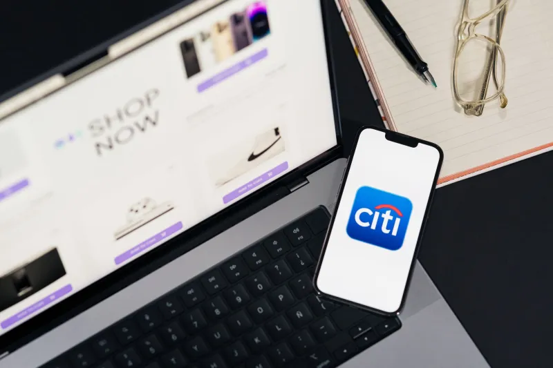
Open your banking app and notice something you have likely never questioned: the blue. It is not a bold blue, not a playful blue, but a particular species of desaturated, trustworthy blue — the kind that appears across Chase, Venmo, PayPal, and nearly every financial product marketed to American consumers. This uniformity is not coincidence. It is the visible output of an invisible industry.
The Laboratory Behind the Palette
Internal design documentation reviewed across multiple consumer platforms reveals a consistent pattern: color is treated as a conversion instrument, not a decorative choice. Design systems at major US tech companies maintain color tokens with names like "action-primary" and "alert-critical" — labels that describe function, never appearance. The hue is secondary to the behavioral job it performs.
The research underpinning these choices traces back decades. Studies on color psychology have repeatedly suggested that blue evokes stability and competence, which explains its dominance in finance. Red, by contrast, raises arousal levels — a physiological response designers exploit when they want a user to act now. That red "Confirm Purchase" button is not communicating danger. It is communicating urgency, and the distinction matters commercially.
What a Single Shade Can Be Worth
The most revealing artifacts in this space are A/B test results — experiments run on millions of users where the only variable is a color value. In one widely circulated example from the early social media era, a green button outperformed a blue one by a measurable margin, generating headlines in the design community. But the deeper lesson was more unsettling: users could not articulate why they clicked. The preference operated entirely below conscious awareness.
Later leak-adjacent disclosures from e-commerce platforms have described similar dynamics. Changing a checkout button from gray to orange reportedly lifted conversion by low single digits — figures that, across an enterprise revenue base, translate to millions of dollars annually. One shade. No copy change. No feature change.
Calm Money, Hot Money
Look closely at how American fintech deploys color by context, and a deliberate architecture emerges. Account balances and savings dashboards live in cool, low-saturation environments — soft blues, gentle greens, generous white space. The visual message is stability; nothing to see here; leave your money where it is.
Then compare the trading and investing surfaces of the same companies. Stock purchase flows, crypto toggles, and options screens run hotter: brighter accents, higher contrast, momentum-friendly greens and reds borrowed from trading floor aesthetics. The palette is engineered to match the desired emotional temperature of the transaction. Saving should feel like a warm bath; speculating should feel like a game.
This bifurcation is documented in onboarding flows and design critiques alike. The same user, on the same phone, on the same night, is being chromatically coached into two different financial mindsets depending on which surface they have opened.
Red as a Compliance Disguise
Not every red element is persuasion. Some are liability management wearing persuasion's clothes. Subscription cancellation flows — the ones US regulators have scrutinized under "click-to-cancel" enforcement — frequently bury the termination path behind muted, low-contrast text while keeping upgrade buttons vivid and large. Color here functions as a legal argument: the cancellation option exists, technically visible, technically clickable. That it was chromatically designed to be missed is a fact the interface never has to admit.
Consumer advocates have argued this constitutes dark pattern behavior; companies counter that accessibility standards and brand guidelines govern their choices. Both can be true simultaneously, which is precisely what makes the practice durable.
Reading the Grid
None of this requires paranoia to observe — only attention. The next time an app feels calm, urgent, or trustworthy, ask whether that feeling arrived before any information did. Color is the fastest channel from screen to nervous system, faster than words, faster than layout. It is also the least regulated.
For users, the practical defense is unglamorous: slow down at color-heavy decision points, and treat any interface that makes you feel before it lets you think as a signal worth decoding. The palette is speaking. It has simply never introduced itself.